Overview
This example walks through how the expected goals (xG) models in
nhlscraper are built and how to interpret them. Our goals
are twofold: first, to show which features contribute to a shot
attempt’s xG value; and second, to demonstrate how the package’s data
acquisition and cleaning utilities support that modeling workflow. For
all hockey-related technical terms and definitions (e.g., Corsi/SAT,
Fenwick/USAT, rebound, rush), we can access the glossary.
# Load library.
library(nhlscraper)

# Access glossary.
glossary <- nhlscraper::glossary()
Wrangling
Scraping
We begin by assembling the dataset used to fit and evaluate our xG
models. In earlier versions of this workflow, we had to manually loop
over every game in the seasons of interest, fetch each game’s
play-by-play, and then stitch them together as demonstrated in the
legacy code here.
With the new update 0.4.0, this process is much simpler: we
can retrieve a full season’s worth of play-by-plays with a single
function call, and then combine multiple seasons into one modeling
dataset.
# Load data.
gc_pbps_20222023 <- nhlscraper::gc_pbps(20222023)
gc_pbps_20232024 <- nhlscraper::gc_pbps(20232024)
gc_pbps_20242025 <- nhlscraper::gc_pbps(20242025)

# Aggregate data.
common_cols <- Reduce(
  intersect,
  list(
    names(gc_pbps_20222023),
    names(gc_pbps_20232024),
    names(gc_pbps_20242025)
  )
)
gc_pbps_20222025 <- rbind(
  gc_pbps_20222023[common_cols],
  gc_pbps_20232024[common_cols],
  gc_pbps_20242025[common_cols]
)
Cleaning
Next, we prepare the play-by-play data for modeling by resolving a number of quirks and inconsistencies in the raw feed. For each event, we attach basic context such as whether the team is home or away, split the game ID into season, game type, and game number, and convert period/time information into continuous seconds elapsed in the game.
# Flag home/away.
gc_pbps_20222025_is_home_flagged         <-
  nhlscraper::flag_is_home(gc_pbps_20222025)

# Strip game ID.
gc_pbps_20222025_game_id_stripped        <-
  nhlscraper::strip_game_id(gc_pbps_20222025_is_home_flagged)

# Strip time and period.
gc_pbps_20222025_time_period_stripped    <-
  nhlscraper::strip_time_period(gc_pbps_20222025_game_id_stripped)
We then derive the key hockey and game-state features that drive xG: strength situation (empty net status, skater counts, man-advantage differential, and strength state labels), rebound and rush indicators, and shot-volume measures such as goals, shots on goal, Fenwick (USAT), and Corsi (SAT).
# Strip situation code.
gc_pbps_20222025_situation_code_stripped <-
  nhlscraper::strip_situation_code(gc_pbps_20222025_time_period_stripped)

# Flag rebound shot attempts.
gc_pbps_20222025_is_rebound_flagged      <-
  nhlscraper::flag_is_rebound(gc_pbps_20222025_situation_code_stripped)

# Flag rush shot attempts.
gc_pbps_20222025_is_rush_flagged         <-
  nhlscraper::flag_is_rush(gc_pbps_20222025_is_rebound_flagged)

# Count goals, SOG, Fenwick, and Corsi.
gc_pbps_20222025_goals_shots_counted     <-
  nhlscraper::count_goals_shots(gc_pbps_20222025_is_rush_flagged)
Finally, we normalize coordinates so that all shots are taken toward the +x direction and compute the Euclidean distance and angle to the net, restricting the dataset to non-shootout, non-penalty-shot attempts.
# Normalize coordinates to +x.
gc_pbps_20222025_coordinates_normalized  <-
  nhlscraper::normalize_coordinates(gc_pbps_20222025_goals_shots_counted)

# Calculate distance.
gc_pbps_20222025_distance_calculated     <-
  nhlscraper::calculate_distance(gc_pbps_20222025_coordinates_normalized)

# Calculate angle.
gc_pbps_20222025_angle_calculated        <-
  nhlscraper::calculate_angle(gc_pbps_20222025_distance_calculated)

# Keep only shots.
gc_shots_20222025 <- gc_pbps_20222025_angle_calculated[
  gc_pbps_20222025_angle_calculated$typeDescKey %in%
    c('goal', 'shot-on-goal', 'missed-shot', 'blocked-shot'),
]

# Remove shootouts and penalty shots.
gc_shots_20222025_final <- gc_shots_20222025[
  !(gc_shots_20222025$situationCode %in% c('0101', '1010')),
]

# Indicate goal or not.
gc_shots_20222025_final$isGoal <- as.integer(
  gc_shots_20222025_final$typeDescKey == 'goal'
)
Modeling
Baseline: xG_v1
The first model, xG_v1, is a baseline logistic
regression for shot success. The response is isGoal (1 if
the shot is a goal, 0 otherwise), and the predictors are
distance (Euclidean distance from the shooter to the net),
angle (shot angle relative to the center of the net),
isEmptyNetAgainst (whether the opposing goalie has been
pulled), and strengthState (game state at the time of the
shot, such as even-strength, power-play, or penalty-kill).
# Build xG model version 1.
xG_v1 <- glm(
  isGoal ~
    distance +
    angle +
    isEmptyNetAgainst +
    strengthState,
  family = binomial,
  data   = gc_shots_20222025_final
)

# Summarize model 1.
summary(xG_v1)| Term | Estimate | Std. Error | z value | Pr(>abs(z)) | Signif. |
|---|---|---|---|---|---|
| (Intercept) | -1.8999656 | 0.0153661 | -123.65 | <2e-16 | *** |
| distance | -0.0337112 | 0.0004019 | -83.89 | <2e-16 | *** |
| angle | -0.0077118 | 0.0002960 | -26.06 | <2e-16 | *** |
| isEmptyNetAgainstTRUE | 4.3321873 | 0.0468759 | 92.42 | <2e-16 | *** |
| strengthStatepenalty-kill | 0.6454842 | 0.0395962 | 16.30 | <2e-16 | *** |
| strengthStatepower-play | 0.4080557 | 0.0158283 | 25.78 | <2e-16 | *** |
On the log-odds scale, both distance and
angle have negative coefficients: as you move farther from
the net or shoot from a sharper angle, the probability of scoring
decreases. The strong positive coefficient on
isEmptyNetAgainstTRUE reflects how much easier it is to
score into an empty net. Relative to even strength, both power-play and
penalty-kill situations have positive effects, indicating higher
conversion rates for shots taken in those states, conditional on a shot
occurring.
Extended: xG_v2
The second model, xG_v2, extends the baseline
specification by adding two play-context features:
isRebound and isRush. The response is still
isGoal, and we retain all the predictors from
xG_v1 (distance, angle,
isEmptyNetAgainst, and strengthState) while
allowing the model to account for whether the shot is a rebound (fired
shortly after a previous shot without a change of possession) or a rush
chance (taken quickly following a transition up ice). The exact
definitions are defined in the glossary and here.
# Build xG model version 2.
xG_v2 <- glm(
  isGoal ~
    distance +
    angle +
    isEmptyNetAgainst +
    strengthState +
    isRebound +
    isRush,
  family = binomial,
  data   = gc_shots_20222025_final
)

# Summarize model 2.
summary(xG_v2)| Term | Estimate | Std. Error | z value | Pr(>abs(z)) | Signif. |
|---|---|---|---|---|---|
| (Intercept) | -1.9963221 | 0.0160219 | -124.600 | <2e-16 | *** |
| distance | -0.0315542 | 0.0004081 | -77.314 | <2e-16 | *** |
| angle | -0.0080897 | 0.0002955 | -27.374 | <2e-16 | *** |
| isEmptyNetAgainstTRUE | 4.2879873 | 0.0463690 | 92.475 | <2e-16 | *** |
| strengthStatepenalty-kill | 0.6673946 | 0.0397394 | 16.794 | <2e-16 | *** |
| strengthStatepower-play | 0.4089630 | 0.0158707 | 25.768 | <2e-16 | *** |
| isReboundTRUE | 0.4133378 | 0.0180973 | 22.840 | <2e-16 | *** |
| isRushTRUE | -0.0657790 | 0.0376508 | -1.747 | 0.0806 | . |
Compared to xG_v1, the coefficients for
distance, angle, and the strength-related
variables are broadly similar, but the model captures additional
structure in how certain shot types perform. Rebound shots
(isReboundTRUE) have a strongly positive and highly
significant coefficient, reflecting the fact that rebounds, on average,
are much more dangerous than non-rebound attempts once distance and
angle are controlled for. Rush shots (isRushTRUE) have a
slightly negative coefficient with only marginal statistical
significance at conventional levels. This suggests that, conditional on
location and other covariates, rush shots are not systematically more
(or may even be slightly less) efficient than non-rush shots in this
sample, even though they may intuitively feel more dangerous. The
addition of isRebound and isRush reduces the
residual deviance compared to xG_v1, indicating a modest
but meaningful improvement in model fit while preserving the core
spatial and game-state effects.
Contextual: xG_v3
The third model, xG_v3, builds on xG_v2 by
adding a simple game-context variable: goalDifferential. As
before, the response is isGoal, and we include all of the
spatial and play-context predictors from the previous models
(distance, angle,
isEmptyNetAgainst, strengthState,
isRebound, and isRush). The new term,
goalDifferential, captures the score state from the
shooting team’s perspective at the time of the shot (for example,
leading vs. trailing).
# Build xG model version 3.
xG_v3 <- glm(
  isGoal ~
    distance +
    angle +
    isEmptyNetAgainst +
    strengthState +
    isRebound +
    isRush +
    goalDifferential,
  family = binomial,
  data   = gc_shots_20222025_final
)

# Summarize model 3.
summary(xG_v3)| Term | Estimate | Std. Error | z value | Pr(>abs(z)) | Signif. |
|---|---|---|---|---|---|
| (Intercept) | -1.9942500 | 0.0160242 | -124.452 | <2e-16 | *** |
| distance | -0.0315190 | 0.0004081 | -77.239 | <2e-16 | *** |
| angle | -0.0080823 | 0.0002957 | -27.336 | <2e-16 | *** |
| isEmptyNetAgainstTRUE | 4.2126061 | 0.0468320 | 89.952 | <2e-16 | *** |
| strengthStatepenalty-kill | 0.6601609 | 0.0397645 | 16.602 | <2e-16 | *** |
| strengthStatepower-play | 0.4106154 | 0.0158741 | 25.867 | <2e-16 | *** |
| isReboundTRUE | 0.4172151 | 0.0181043 | 23.045 | <2e-16 | *** |
| isRushTRUE | -0.0709434 | 0.0376484 | -1.884 | 0.0595 | . |
| goalDifferential | 0.0424470 | 0.0039014 | 10.880 | <2e-16 | *** |
Most of the core coefficients are very similar to those in
xG_v2. Closer, more central shots (distance,
angle) are still substantially more dangerous, empty-net
attempts remain extremely likely to result in goals, and both
penalty-kill and power-play states continue to show elevated finishing
rates relative to five-on-five. Rebound shots retain a strong positive
effect, while rush attempts again show a small negative coefficient with
marginal statistical significance. The new goalDifferential
term is positive and highly significant, indicating that, conditional on
location and other covariates, shots taken when the shooting team is
further ahead on the scoreboard convert at slightly higher rates than
those taken when the game is tied or the team is trailing. This effect
is modest in magnitude compared to the big spatial and empty-net
effects, but it does capture additional structure in how game context
influences finishing. The reduction in residual deviance relative to
xG_v2 is incremental but consistent with an overall
improvement in fit.
Visualizing
So far we’ve focused on how the xG models are built. In practice, though, most people experience expected goals through visual summaries rather than coefficient tables. In this section, we show how the three xG models introduced above can be used to summarize individual games, with users free to choose which model (the three from earlier) to apply.
Shot Locations
The first pair of plots shows all shot attempts for one team, normalized so that they always attack to the right. Marker shape encodes the outcome (goal, shot on goal, missed, blocked) and color encodes the shot’s xG bin, from low-danger attempts in dark blue to the most dangerous chances in bright red.
# Plot shot locations for Game 7 Stanley Cup Finals 2025.
ig_game_shot_locations(
  game  = 2023030417,
  model = 1,
  team  = 'H'
)
ig_game_shot_locations(
  game  = 2023030417,
  model = 1,
  team  = 'A'
)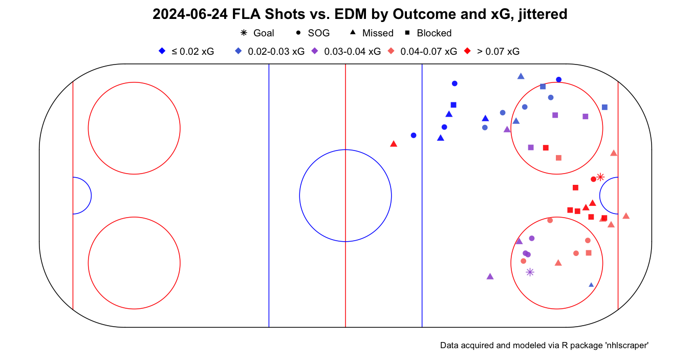
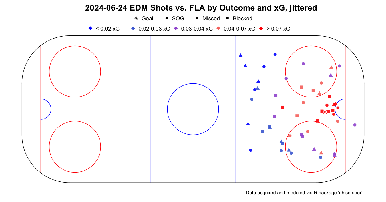
Looking at the home view, we can quickly pick out the team’s preferred shooting areas. In the example game, many of the Panthers’ attempts cluster around the slot and net-front, with several high-xG red markers just off the crease. That pattern is consistent with a team that frequently gets inside position, generates tips and rebounds, and is comfortable attacking through the middle of the ice. Switching to the away perspective, the Oilers’ shot map looks different. There are still dangerous chances around the crease, but we also see a higher volume of lower-xG shots from the outside such as point wristers, sharp-angle attempts, or quick shots off the rush that never quite reach the interior. This kind of map is a nice way to talk about “shot quality vs. shot volume”: a team may outshoot the opponent in raw attempts, but if most of those are blue markers from the perimeter, the expected goals will tell a more balanced story.
Cumulative xG
The second visualization shows cumulative xG over seconds elapsed in game for both teams at once. The x-axis runs from 0 to the end of regulation, with tick marks every 300 seconds (five minutes). The y-axis tracks the running sum of xG, so each step up corresponds to a new scoring chance; flat stretches indicate long periods without meaningful offense.
# Plot cumulative xG for Game 7 Stanley Cup Finals 2025.
ig_game_cumulative_expected_goals(
  game  = 2023030417,
  model = 1
)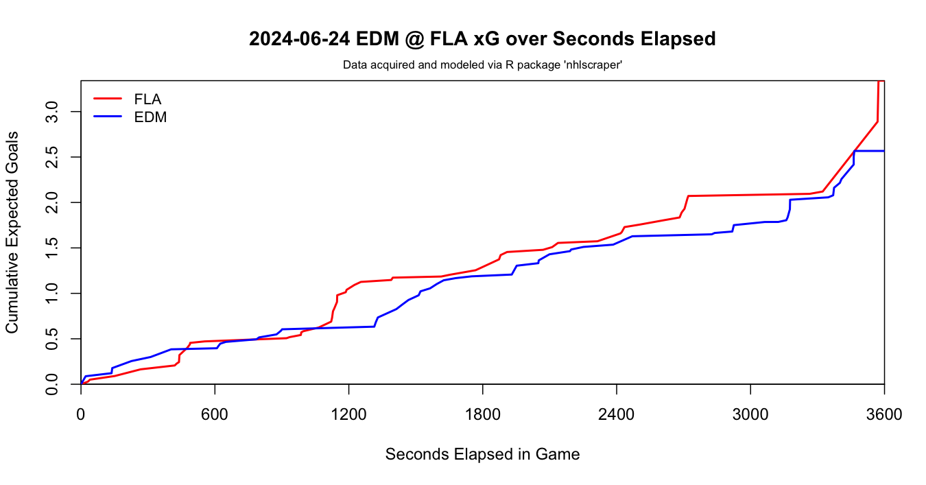
In our example, the red line (Florida) and blue line (Edmonton) track closely for much of the night. Early on, both teams climb in near lockstep, suggesting a fairly even trade of chances. Mid-game, Florida opens a small xG gap with a series of higher-quality looks, visible as a steeper red slope around the 1,000-1,200 second mark. Edmonton answers back later, narrowing the gap with their own sustained push. By the end of regulation the lines finish at similar heights, with Florida holding a modest xG edge. This is the classic “deserve-to-win-o-meter” view: rather than arguing from shots or goals alone, we can say that Florida generated slightly better chances overall, but the game was competitive throughout.
Outlook
As useful as these three xG models are, they are far from perfect.
They are deliberately simple, interpretable logistic regressions built
on a limited set of features. That makes them great for understanding
how basic factors like distance, angle, strength state, and game
situation shape scoring chances, but it also means there is plenty of
room to improve their predictive power. That gap is part of the point of
nhlscraper. The package is designed not just to ship a set
of “finished” xG models, but to make it easy for anyone to download,
clean, and reshape NHL data so they can experiment on their own;
ultimately, the goal is to give you the tools to ask and answer your own
hockey questions, whether that means building a better xG model,
evaluating special teams, profiling individual shooters, or creating
entirely new metrics. If you come up with something interesting, we’d
love for nhlscraper to be part of the story.